

Example Utility Classes and Styleguide Elements Currently Used on aamds.org
General notes:- No page should contain an H1 in the markup (in fact we have Drupal set to remove any level 1 headers at output time). For SEO purposes, only the page title is output as an H1
- H2 - H6 can all be used. For SEO purposes, an H3 should only appear under an H2 (and H4 only under an H3, etc.).
- Responsive tables should be nested in a div with class "table-responsive" (as per Bootstrap 5). See the table section below for more information.
- Embedded videos can only be included in content with 'text format' set to "Extended HTML" or "Full HTML". These should be nested in a div with class "video-responsive". See the video section below for more information.
- The site makes use of Font-Awesome 7 for glyphs / icons: fontawesome.com/search.
Paragraph class: .notice
This paragraph style is for displaying notices in blocks, through Views, etc. Example: AA&MDSIF is pleased to share the questions from nursing professionals and answers from our experts provided are intended for general guidance and should be considered within the standard protocols for your medical setting.
Donec laoreet libero eu purus tristique ullamcorper ac sed sapien. Sed nisl metus, dignissim in euismod et, accumsan in dui. In tempor, eros et lacinia suscipit, leo magna facilisis urna, nec mollis mauris tortor a magna. Ut metus sapien, convallis vitae sollicitudin vel, aliquet eu elit. Proin ullamcorper tincidunt est, tristique euismod turpis posuere eu. Praesent et erat tortor, lacinia feugiat tellus.
Div Class: .callout
Div class="callout" is for small "boxes" of text. In previous designs these floated right, but now fill the content container). They should contain an h2 and at least one paragraph or list (p, ul, or ol tag). Nam pharetra facilisis malesuada. Etiam at arcu ut eros consequat tempor vitae at nulla. Sed tempus, nibh non consectetur laoreet, ligula velit pellentesque erat, vitae egestas quam nisl et dolor.
Div class: .callout-full
Div class="callout-full" is for "boxes" of text that should fill the entire content area (made largely redundant by past changes to .callout). They should contain an h2 and at least one paragraph or list (p, ul, or ol tag). Since .callout is now full width .callout-full outputs with backgrounds to make it stand out. However, in the future this element can likely be deprecated. Proin elit nunc, volutpat quis venenatis a, interdum eget est. Phasellus id consectetur tellus. In sem nisl, sollicitudin non volutpat ac, vestibulum id erat. Proin dictum purus dignissim sapien pulvinar tincidunt.
Vivamus magna ligula, lobortis vel elementum at, luctus nec ligula. Etiam gravida est sed elit tincidunt rhoncus. Phasellus nec orci aliquet eros scelerisque cursus. Aenean at diam vel nibh fringilla porttitor. Sed blandit molestie libero vitae sollicitudin. Curabitur neque metus, lobortis sed mollis at, tristique nec massa. Vivamus ut auctor sem.
Blockquote Element
The blockquote element can be used to provide quotes from people. Donec a ornare nibh. Praesent aliquet magna sit amet felis fermentum congue et sit amet dolor. Aenean justo tortor, tristique id faucibus sed, ultricies sed odio.
Blockquote.size-md Element
The blockquote element can also be sized smaller for specific contexts using the class "size-md". Donec a ornare nibh. Praesent aliquet magna sit amet felis fermentum congue et sit amet dolor. Aenean justo tortor, tristique id faucibus sed, ultricies sed odio.
Bootstrap Responsive Tables
Bootstrap 5 provides responsive tables by wrapping the table in a .table-responsive div. Tables themselves should include the class "table", and can optionally include: "table-bordered" (adds table border lines), "table-striped" (adds 'zebra striping' to table background), "table-hover" (adds a hover state / highlight per row), and "table-condensed" (halves the cell padding).
| Header | Alt. Header |
|---|---|
| curabitur ante | diam ultricies |
| vitae tempor ut | molestie id augue |
| cras auctor | interdum quam |
TABLE class: .tablestyle-1
Includes optional th class="first" and th class="last" on the first and last table headers (these add the rounded corners - if omitted, the corners will be square).
| Header | Alt. Header |
|---|---|
| curabitur ante | diam ultricies |
| vitae tempor ut | molestie id augue |
| cras auctor | interdum quam |
TABLE class: .tablestyle-2
Includes optional th class="first" and th class="last" on the first and last table headers (these add the rounded corners - if omitted, the corners will be square).
| Header | Alt. Header |
|---|---|
| curabitur ante | diam ultricies |
| vitae tempor ut | molestie id augue |
| cras auctor | interdum quam |
UL class: .nav.nav-pills
The Bootstrap 5 UL class="nav nav-pills" replaces the older "horiz-nav-auto-active" for simple lists of links that should be formatted as a horizontal list. Using the "active" class on the link will cause it to be highlighted. In this instance, it should be wrapped in a NAV container with an ARIA-LABEL for accessibility.
Responsive container for youtube videos: .video-responsive
Mark / "Highlighter" Styles
Use .mark in extended HTML, or the <mark/> tag in full html (both are defined in bootstrap core) to make text stand out as "marked".
"Figure" and "Figcaption"
For graphs or figures, the figure and figcaption design pattern should be used:

Links as buttons
The site uses bootstrap button styles and optional Font-Awesome icons to turn simple anchor / links into buttons with optional icons:
Primary Button (glyph - fa-video) Success Button (glyph - fa-star) Info Button (glyph - fa-bullhorn) Warning Button (glyph - fa-triangle-exclamation)
Any of the button classes can be enhanced with `btn-wide` for a wider button (desktop only - mobile is full-width already) with larger text: Wide Primary Button
If given the custom class "btn-block", the button will fill its parent container:
Primary Block Button (glyph - fa-right)
If placed inside of a div.btn-group container, these will appear as a single "bar" of buttons:
Information "Tags"
A custom element for aamds.org are small inline (span) "tags" that can display a font-awesome glyph - for highlighting special elements in Views titles ("Updates" in the Advocacy Actions section, market research studies in the Clinical Trials section, etc.). There are a few different types which mirror the Bootstrap button types: .tag-primary, .tag-success, tag-info, and .tag-warning.
Example tags:
Tag "Primary" Unam incolunt Belgae, aliam Aquitani, tertiam.
Tag "Success" Quisque ut dolor gravida, placerat libero vel, euismod.
Tag "Info" Pellentesque habitant morbi tristique senectus et netus.
Tag "Warning" Lorem ipsum dolor sit amet, consectetur adipisici elit, sed eiusmod tempor incidunt ut labore et dolore magna aliqua.
Bootstrap "Cards" in Rows / Columns
Bootstrap 5 ".card" elements can be grouped into ".row" / ".col-*-*" containers to make responsive blocks of image/header/text. See the example below, or for full documentation see: Bootstrap documentation → Components → Cards.
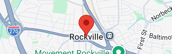
Single Red Pin
This shows a single specialist on the map. You can click or tap the pin for their full name and practice details.
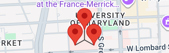
Group of Red Pins
This shows a group of specialists that share an address. You can click or tap an individual pin for their full name and practice details.
Sponsorship Level Headers
Use h2.sponsor-LEVEL where LEVEL is diamond, platinum, gold, silver, bronze, or "nolevel" to add a header with a colored background (.h3 - .h6 will work too if necessary to preserve semantic sequencing / levels)
Our Diamond Level Sponsors:
Our Platinum Level Sponsors:
Our Gold Level Sponsors:
Our Silver Level Sponsors:
Our Bronze Level Sponsors:
Our Other Sponsors:
Logo Grids
Logos can be arranged into a grid of 1 / 2 / 3 / 4 / 6 columns using standard Bootstrap wrappers of .col-md-12, .col-md-6, .col-md-4, .col-md-3, or .col-md-2 for each logo.


Text based sponsor
Thank you to our sponsor Taiho Oncology.